Case Study 02
Sun Child Baby Food is a company that makes healthy but delicious food just for babies and young children. They make foods that are similar to the kind that adults eat, but they are made with special textures that is more chewable for babies. It also has a high concentration of nutrients.
Target Audience
Ages 30 -70
Parents and Grandparents
Online shoppers
In-store shoppers
Attributes
Healthy, Cute, Supplements
Role
Package design
Logo
Advertisement design
Research
I researched different baby food products online and at the brick and mortar stores to get an idea of what the packaging looks like. I found that most designs were quite minimalistic except for the “Gerber Natural” brand which incorporated real photos in the design. I liked the idea of using real life images rather than just Vector images created with software.
While working on the design, I made a recuring theme based around the shape and the multiple colors of the sun. I made a list of objects that have a round shape and also made a list of words that connotate health, growth and happiness. Much of the research I did on other brands was meant to help me avoid design ideas that had already been used too much because I wanted to help the clients product stand out on the busy shelves in the grocery stores.
Problem
- The client invented a new food product targeting infants and children
but wasn’t sure how to make the packaging stand out among the rest. - Client couldn’t come up with a catchy and original name for product.
Solution
- I designed the packaging in a more artistic way instead of just using a
simple logo so the product would be hard to overlook. - I based the brand design on a universal image that promotes strong
and natural growth.
Benefit
- Customers are drawn to the design alone and are willing to give the
product a chance. - The innovative and novel style of the design reflects the innovative and
novel style of the product its’ self.
Design Process
- This design started with a phrase first which allowed me to explore
concepts that revolve around it. - I looked through mock-ups of food packaging first to get inspired.
- After sorting through phrases similar to “Sun Child” I thought of a
“sunflower” and then I imagined a baby’s face in the middle of the
sunflower. - I used Illustrator to super-impose a baby’s face over a sunflower.
- I chose a font that had negative space inside of the letters so I could
use a gradient that includes the various colors of the sun and then set
the text on a curved path around the top of the sunflower. - I then used a radial gradient to place a white halo behind the image.
- All colors and shapes were designed synonymously to the those of
the sun.
RESULTS
My Sun Child branding design helped my client push their product to a remarkable degree. The product now stands out among others on the shelves in the brick and mortar stores as well as in the Online market place. The sunny colors invoke a warm and comfy feeling in the customers which makes them want to purchase the product. The message elicited by the design perfectly matches the mission of the company who want to promote health and happiness among babies and children.

Component 1
I chose this image becasue the baby has a very full round face which perfectly matches the circular theme of he other components in the design. His eyes are looking upward as if hes looking at the sun and the text that archs over his head.
Component 2
I chose this particular sunflower image becasue it has a simple background that is easy to remove. I also liked that the entire flower is visible because it makes for a better composition. Not to mention the vase adds a nice touch as well.
Component 3
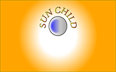
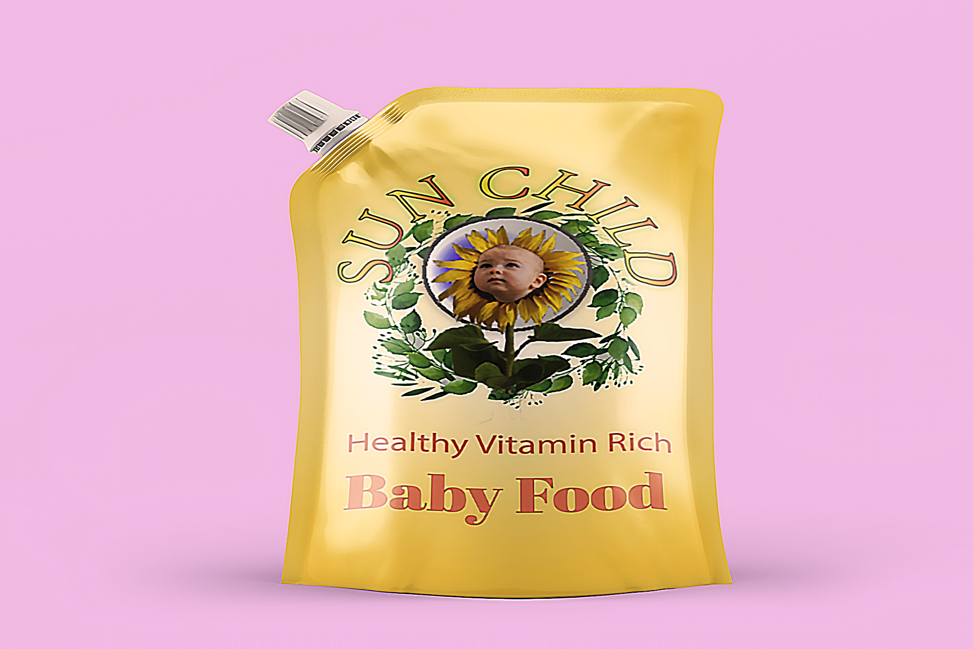
I wanted to frame the baby’s head with something circular to keep the sun theme consistent. I gave it kind of a glassy look as well. I typed out the logo on a path that arches over the sunflower and added a gradient consisting of the different colors of the sun’s different layers.
Finished Product
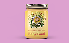
The final draft of the design was very easy to work with when it came time to fit it onto the packaging in the mock ups. I used a more basic font for the details of the product due to it’s easy readability.

