Case Study 04
Bride Of Earth is a new and upcoming crossover band from Austin, Texas. Their music transcends the limitations of genre and style. They have a an experimental/electronic side as well as a more conventional style and they dabble in many genres which makes them difficult to label.
Target Audience
Ages 18 to 40
Rock and Alternative Music fans
Experimental Music fans
Attributes
Eclectic, Emotive, Experimental
Role
Album cover design
Poster design
Promo design
Research
After getting to know the band mates and their music, I did some brainstorming with pen and paper. For each song, I wrote out some descriptive words and then began matching each word to a shape and color. I also read through the lyrics and picked out some lines that had the strongest imagery.
I also took some time to observe the album covers of other similar bands. There was a wide range of genres to consider but after looking at the album cover art of these different bands, I made a list of all the colors, fonts and images that they used. I then thought of different ways that I could combine these different styles into one so that the design properly represented this Cross-over band. I came to the conclusion that the theme should based more on the philosophy and emotional content of the music rather than a genre.
Lastly, I spent a few nights listening to their music while going to sleep in hopes that I would have some highly vivid and visual dreams that I might be able to pull some ideas from.
Problem
- The client has recently released their first LP but they have no clue how
to promote it visually since the music style is so Eclectic. - The emotional content varies from song to song so it’s difficult to know
how to create any expectations for the record-buying public
Solution
- I helped the band create a suitable image for their music.
- I created a design that helped them visually express the different facets of their musical expression without leaning too far in any one direction.
Benefit
- The potential listener now has clear idea of what kind of music Bride Of
Earth play by looking at the cover art which can now be categorized in
the Online music libraries. - The band now has a compelling design that is hard to ignore by music
fans as they’re randomly scrolling through the Online music catalogs.
Design Process
- I wrote out some lyrics from the songs, and wrote down colors and
shapes that correspond with the words. - I started drawing random shapes while listening to the songs to see what
kind of images might pop up from my subconscious. - I imported a picture of the singer into Figma and began distorting the image different ways with the image crop function until I got something that
reminded me of one of my automatic drawings. - I copied the distorted face several times and then added a blurry effect to
it; I used it as the main image and placed a small one in the font. - I chose dark Magenta theme color to match the mysterious and somber
quality of the music. - I used a font with sharp serifs and colored it electric blue to emphasise
the electronic feel of the music.
results
The album cover art that I designed for Bride Of Earth helped them define their image which was a difficult task considering their Eclectic style and the wide range of emotional content in thier work. The design made it easier for them to promote thier LP on the Online streaming platforms. The artwork also gave them a conceptual frame work for future ideas and helped them create their visual image on the stage.
Strategy
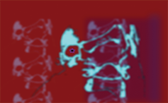
This is an image of the singer’s face; I took a picture of him, imported it into Figma and then distorted it. The distorted image loosley represented some shapes I had drawn on a peice of paper while listening to Bride Of Earth. It represents the feeling of being twisted and going mad that is conveyed in some of their lyrics.
Marketing
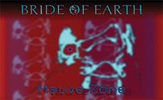
Here I copied the distorted face several times and and did some cropping to convey the sort of creative schitzophrenia that the composer was experiencing when he wrote some of the music and lyrics. I set the image against a Magenta background with shades of purple to represent the feeling of being isolated but mystified and also to convey the spiritual and emotional bruising that he felt.
Branding
Finally, I added the font and the logo. I chose an Electric Blue color for the band name to represent the Electronic elements in a lot of their music. I also placed a tiny version of the distorted face in the letter ‘O” of of the name. Lastly, I added a drop shadow to the title of the LP to represent how many of the song concepts are based on delving into the dark shadowy side of human nature.
Usercentric
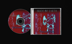
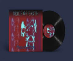
Here is the finished product printed out on a CD cover. The band also plans to release their LP on Vinyl since they are coming back into style. The artwork was also used on the streaming platforms that the band had been included on via Distrokid. So far, they have also used the same artwork for their concert flyers. I will be making more designs for them in the near future for different flyers and also for the tee shirts that they plan on selling.

