Case Study 05
Frederick’s Financial Planning is a corporation that helps people strategically get out of debt and teaches young adults how to handle their finances responsibly. They also provide courses that teach people how to be strategic and find clever ways to invest.
Target Audience
Ages 18 to 70
General Public
Debtors
Attributes
Investment Firm, School, Accountants
Role
Website home page design
Brochure design
Business card design
Research
I looked at all kinds of different websites and brochures of different financial planning associations to get an idea of what kind of backgrounds and lay-outs are standard. I found that most websites had plain, white backgrounds with a lot of negative space. Most desings of this sort use green font if not black due to the color’s association with currency. They almost always use a very readable San Serif font. And then most of the images used are of people interacting with professionals.
I then read through all the brochures of the company I was designing for so I could get a very clear idea of what services they offer to whom and what makes them stand out from other companies who offer the same services.
After researching Frederick’s Financial Planning’s services and missions, and studying the design implemented by similar associations, I got a clear idea of what should stay conventional in the design and what can be approached with a little more artistry and originality. I found that it is a very delicate balance between convention and originality. I wanted to keep the minimalist approach yet make the design more inventive than most. Also, I wanted to add one small detail that wouldn draw people’s attention, but without being too glaring.

Problem
- The client was having trouble advertising his company in a way that
stands out among the competition. - All the different websites for Financial Associations look so similar that it
is too easy for them to be overlooked.
Solution
- I helped the company stand out more by designing a more interesting
logo that glows and glistens which makes it hard to ignore. - I made a design that has more substance and intrigue without having to
sacrifice too much of the negative space necessary in corporate designs.
Benefit
- The company’s website, ads and billboards now have a more unique look
than that of other Financial Planning Associations. - Customers are drawn to the glowing logo and now they click on that
company’s link first.
Design Process
- For this design, I started making shapes in Figma; mostly rectangles and
triangles, until I could envision some kind of relevant object. - I created a sort of grid that reminded me of a spread sheet.
- Next, I started looking at images of money and taking notes of the different
design elements I see on coins and dollars. - I was drawn to the triangular shape of the pyramid on the dollar bill so I
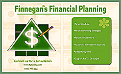
placed a triangle in the center of the grid shape. - I made a dollar symbol and then I imported the design into Illustrator and
added a glowing effect. - For the back ground, I used images of $100 bills and lowered the opacity
and then I placed a green frame over them and brought down the opacity
to make the background design more subtle. - Lastly, I made a pencil image with basic shapes and placed over the grid.
results
As a result of the design work I did for Frederick’s Financial Planning, their clientell grew by 50% over a period of three months. The click-through rates of thier website also increased by 45% in the same amount of time. It was mostly the glowing effect that I applied to the dollar sign in the logo that caught people’s attention the most. Just by having a more fun and optimistic design, FFP attracted more potential clients.
Component 1
This is the fisrt draft where I had simply made some random shapes in Figma and moved them around until they represented something relevant. The grid reminded me of an Excel spread sheet and the triangle made me think of the pyramid on the dollar bill.
Component 2
Next, I had written a list of relevant words and objects that had to do with financial planning. I wanted to be able to express what the company was about with 2 simple objects and in the most minimalist approach possible. So a dollar sign and a pencil seemed to speak the most clearly about the concept. Everything is made from basic shapes in Figma.
Component 3
Finally, I made a lay-out that was artistic yet minimalistic with what appears to be negative space. I placed the $100 bills in the background and lowered the opacity and then placed another frame with low opacity over it to wash it out. I used some variation of the green color. I used the background money image as a grid for the placement of my text and my logo.
Final Result
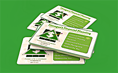
Here is the final result. I had to use some variations based on what the design was being used for; Business cards needed less components in the design so I just included the most important info. I also had to leave components out for billboards for the casual reason that people quickly passing by wont be able to read the more detailed info. Smaller billboards and brochure covers included the entire design with all of the elements from the original version.


