Case Study 06
Mezmerize for Men’s Health and Beauty has just put a bran new beard oil on the market. Mazuri Beard Oil is an enhanced product made of the best essentials for healthy skin and facial hair and it is packaged with a striking and elegant new look that promotes nothing less than class and high quality.
Target Audience
Ages 20 to 50
Men, Men of African decent, Classy men
Professionals and male models
Attributes
Men’s health, hygiene and grooming products
Role
Product name and logo
Advertisement design
Packaging design
Research
I studied the previous designs of similar products from other companies to get an idea of what not to do, but also, to get an idea of what should be implemented in the design process . I noticed that many product designs were minimal and that they had a black background on the label and the packaging; I decided that these design elements were fundamental and so I replicated them. But I also noticed how so many of them were way too on-the-nose. Most designs literally consisted of a beard which makes sense and all, but the image had already been used way too many times.
While most of the other designs were masculine in a very obvious way, I wanted to take a more unique approach. I thought it would be best to avoid dark earthy colors or grainy textures. Mainly, I wanted to avoid beards and top hats. I wanted to come up with something that eludes more to the Divine Masculine rather than the rugged masculinity that is so often depicted in advertisements for men’s products.
I spent a fair amount of time researching ideas, symbols and stories that reflected the Divine Masculine. Specifically , I searched for inspiration by reading summaries of African tales. I came across some interesting stories but I was still having trouble expressing that idea in one simple design or symbol. So my next step was to explore ideas in a more subconscious and aimless way in hopes that i would serendipitously stumble upon a good idea for a design.
Problem
- The client was having trouble advertising their new product in a way that
stands out among the competition. - All of the design concepts that they were previously exploring and drafting were too literal and too similar to those of other products from their competitors and would, consequently, end up looking too cliche’ and getting overlooked by consumers.
Solution
- I made a design that expresses the elegance and high-quality of the new product on a more subconcious level.
- I approached the task with much more creativity and used my knowledge of abstract art to influence the public in a much more insticntual way.
- I used my knowlege of ancient symbolism to generate an archetypal idea that would lead to a designnthat would speak to people on an instinctual level in a pwerful way.
Benefit
- Mezmerize now attracts more of the classy and wealthy demographic that they had intended.
- The level of creativity and attention to subconciousimpressions closely reflects the kind of product that this company offers .
Design Process
- While I am usually recruited by companies and musicians to merely design the look of a product, I was also hired to brand the product and give it a name this time.
- I started with the name first: I researched words in African languages that are synonymous with class and beauty. I found the word “Mazuri” which means “good looks” in the Swahali language. Th word seemed perfect beacuse it wasn’t over-used in thde American market and beacuse it is also catchy and easy to pronounce.
- For the logo, I tried some literal designs like diamonds and crowns but I felt like they were too literal, so i tried a more abstract approach; I used the pen tool in Illustrator to make random shapes.
- Next, I started erasing random parts until I got a shape the really spoke to me.
- I used curved strokes with sharp serifs until I got a shape that conveyed elegance yet sharpness.
- Serendipidiously, I ended up with a design that closely resembled the Kundalini serpent which is a symbol of spiritual power and sexual prowess.
- Then I made a Gold gradient to convey high class and quality.
- Finally, I chose a font that had sharp serifs to represent a sharp look.
results
As a result of the design work I did for Mezmerize’s newest product “Mazuri Beard Oil, their sales have been significantly high and they’ve had a 30 % increase in new customers. Offering them a fresh perspective and a more instinctual approach has resulted in a much more original design that stands out among the competition and piques the interest of their new target audience.
Component 1
This is the first draft where I used the pen tool in adobe Illustrator to make random shapes; it was sort of like automatic art where I just let my subconscious mind guide my hand. The next step would be a reductive process where I sort of randomly erase parts.
Component 2
Next, I started erasing strokes and rejoining them from different angles until I discovered a shape that really moved me in some instinctual way. This was the shape that I ended up with. The next time I sat down to look at it I realized that it resembled the Caduceus and the Kundalini Serpant.
Component 3
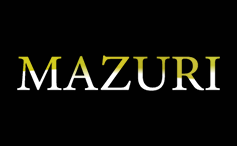
Here is the font that I chose based on its elegant yet sharp look. I was trying to go for a minimal look in order to convey value and so chose this light weight font. I also liked the sharp looking serifs because I thought the look of them represented the sharpness of a well-groomed and well-dressed man.
Final Result
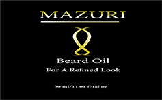
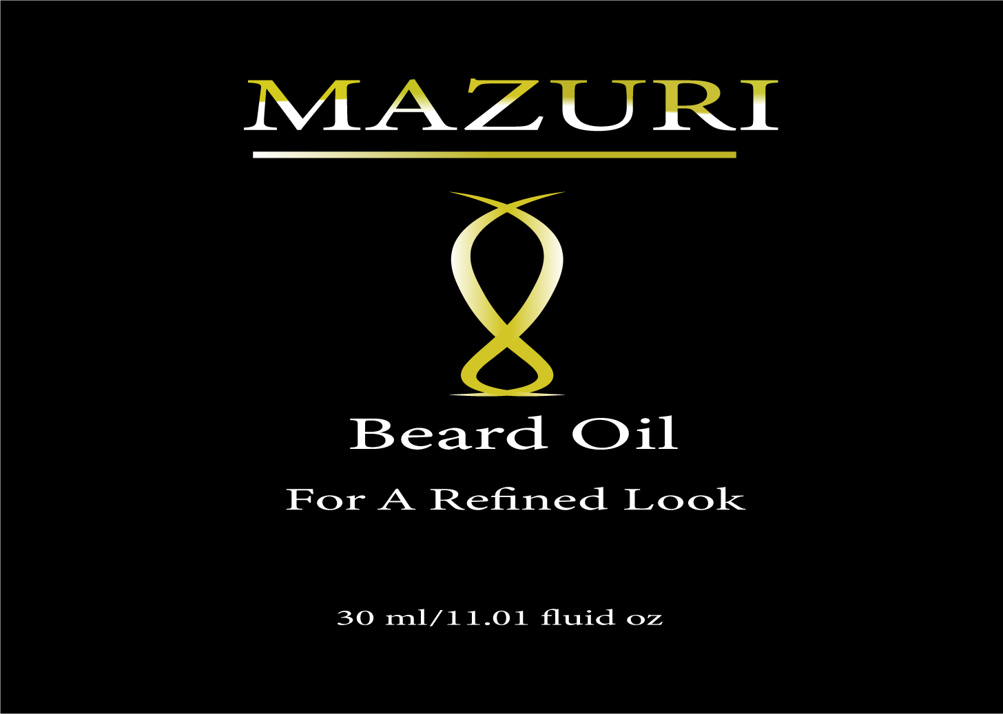
Here is the final result; A logo that looked much like two serpants intertwined which, to me, represents Kundalini serpants. I made a golden gradient to convey value and also left plenty of negative space in the background. I felt like all the elements that were needed were present in the deisgn; value, sexual prowess, beauty and elegance.

